ShopDreamUp AI ArtDreamUp
Deviation Actions

Species Collector
Protector Spirits, Protectors of the Spirit Masks, they have great protentional, and can grow to be quite powerful they are the protectors of the remains of the one who created everything, not even the gods can stand up to their most powerful clans.
$100/month
Suggested Deviants
Suggested Collections
You Might Like…
Featured in Groups
Description
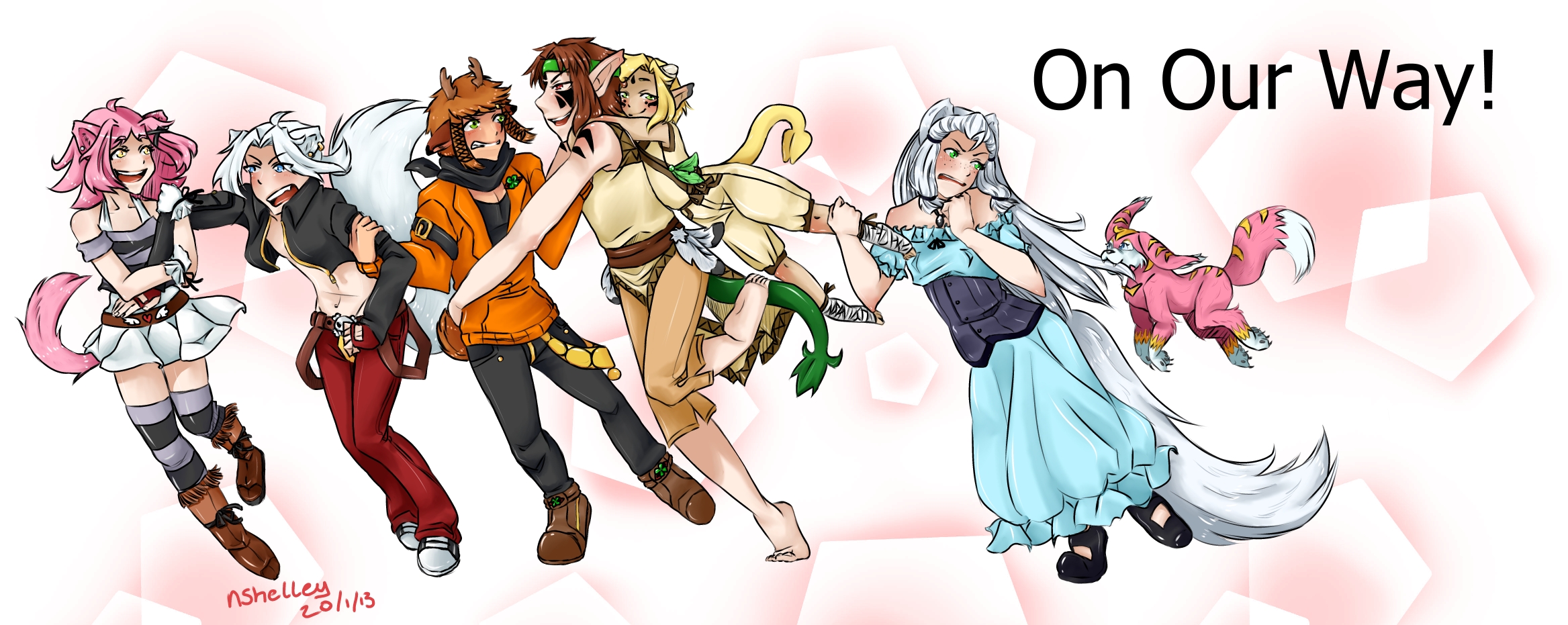
Now! Where to begin!
This piece has a lot of firsts for me, such as:
This many characters in one piece
It's the first time I have drawn Leem and Penny
Never really worked on a piece this big before
And then there's their poses, never really drawn people running before XD
So yeah! I understand Leem's left foot is, well, arghhh! I drew it like... 15 times! No exaggerations!
I decided to put a critique on it so I could see how well my Folds, shading, anatomy and proportions and so on have improved!
I am very happy with the out come so I really, REALLY hope you like! Please comment, would really appreciate it! ^^
Tropic Mews belongs to © *LovelyKouga Krista
Artwork belongs to © *loverofmanga me! ^^
Image size
2335x931px 985.45 KB
© 2013 - 2024 NutnutChi
Comments21
Join the community to add your comment. Already a deviant? Log In
You say it's a lot of firsts, but I think the overall product shows how much time and effort you put into it. I know how it is to redraw a hand or foot mannnny times and then just have to keep going, so I won't point it out. I don't think he looks like he's running, but he does look like he's in motion or about to be in motion and that he is being weighed down by the figure on his shoulders and the rest of the characters do have a sense of interacting and are pretty well composed.
The level of details and the various poses and body language of the characters are nice. I think they would look more natural if there was a better sense that they are all on the same ground line. I also think it's a bit unclear at first that the figure on the right is pulling on the smaller character's leg because there isn't enough negative space or contrast in the values to draw attention to it. The shading looks fairly well placed, but you could have gone a bit darker to give it more depth (it's a bit pale and washed out especially against the background). The lines are nice and the characters have a variety in their heights and body types and clothing which makes for an interesting looking cast. The background doesn't really fit with the sense of motion I think you're trying to achieve and the font looks kind of tacked on there, so it may have been better to write it yourself or modify it.
Overall, looks very interesting and cool. What are these characters for?


![[Y] C132: Honoka--chan](https://images-wixmp-ed30a86b8c4ca887773594c2.wixmp.com/f/c6022caf-ad97-4d19-b652-c5dc4987bc8e/ddlxo2i-d9e76992-3438-448f-bd6d-e765175e4f58.png/v1/crop/w_184)
![[Y] C74:Kitsutea](https://images-wixmp-ed30a86b8c4ca887773594c2.wixmp.com/f/c6022caf-ad97-4d19-b652-c5dc4987bc8e/ddb2s4q-f6ced9a5-db77-4de3-a351-8dc728142987.png/v1/crop/w_184)
![[Y] C191: Honoka--chan](https://images-wixmp-ed30a86b8c4ca887773594c2.wixmp.com/f/c6022caf-ad97-4d19-b652-c5dc4987bc8e/ddujiq4-05861154-8b8f-48b8-a992-e623d74a28e9.png/v1/crop/w_184)


![Black Velvet [RWBY]](https://images-wixmp-ed30a86b8c4ca887773594c2.wixmp.com/f/25cf4e75-fdcf-4c4e-aab7-abccc04e8d71/d8ig187-d299b67e-9ba5-49d6-bfcc-6399eca80f48.png/v1/crop/w_184)
![Circus!AU [RWBY]](https://images-wixmp-ed30a86b8c4ca887773594c2.wixmp.com/f/25cf4e75-fdcf-4c4e-aab7-abccc04e8d71/d8khlxi-3861341c-c6c8-4da5-88eb-b6b590bdddad.jpg/v1/crop/w_184)


![[CM] Nea and Qaji](https://images-wixmp-ed30a86b8c4ca887773594c2.wixmp.com/f/b7ac08ed-4c6a-4dc9-a1d3-5f62933be176/day4of5-b814201e-7e38-400b-9521-73ab75f299c3.png/v1/crop/w_184)


![[COMM] - OC Daikon with two girls](https://images-wixmp-ed30a86b8c4ca887773594c2.wixmp.com/f/a7029e28-806e-44f0-a467-be0b120eae4f/deiwc2q-c242b43a-60fd-47f2-9100-69eeb5442b63.png/v1/crop/w_184)


![[EV] .:Melissa y John Collab 2015:.](https://images-wixmp-ed30a86b8c4ca887773594c2.wixmp.com/f/fea7f343-8de6-4350-9ab0-820ce7bb65bc/d8sg68p-489d961d-9bf6-439b-86e3-56c155a58862.png/v1/crop/w_184)


